Fyndafit
fyndafit launched as a boutique creator and athlete management agency in a market crowded with agencies chasing quick wins and follower counts. Positioning itself around long-term, personal partnerships between brands and creators rather than one-off viral moments, the company needed a visual identity that felt distinct from typical creator-economy branding: credible enough for the major consumer brands it partners with, but personal enough to reflect its “people, not profiles” approach. We built fyndafit's full brand identity from scratch: logo, colour palette, typography, and brand system.

Building an identity for people, not just for reach
The creator economy is full of agencies that lean on hype, big numbers, and viral moments as the whole pitch. fyndafit wanted to compete differently, building genuine, long-term relationships between brands, creators, and athletes rather than chasing quick wins. Before any visual direction was set, we worked out how that difference should actually show up, in tone, in confidence, in restraint, so the brand felt considered and credible rather than loud and trend-chasing.
A brand built to sit comfortably next to major consumer names
fyndafit works with genuinely major consumer brands alongside individual creators and athletes at very different stages of their careers. The identity needed to hold its own in both contexts: professional and trustworthy enough for an established brand partner, approachable enough for a creator building their presence for the first time. That balance shaped every decision from here on, from colour to type to how the system needed to flex across different uses.

A logo and identity built around fyndafit's own energy
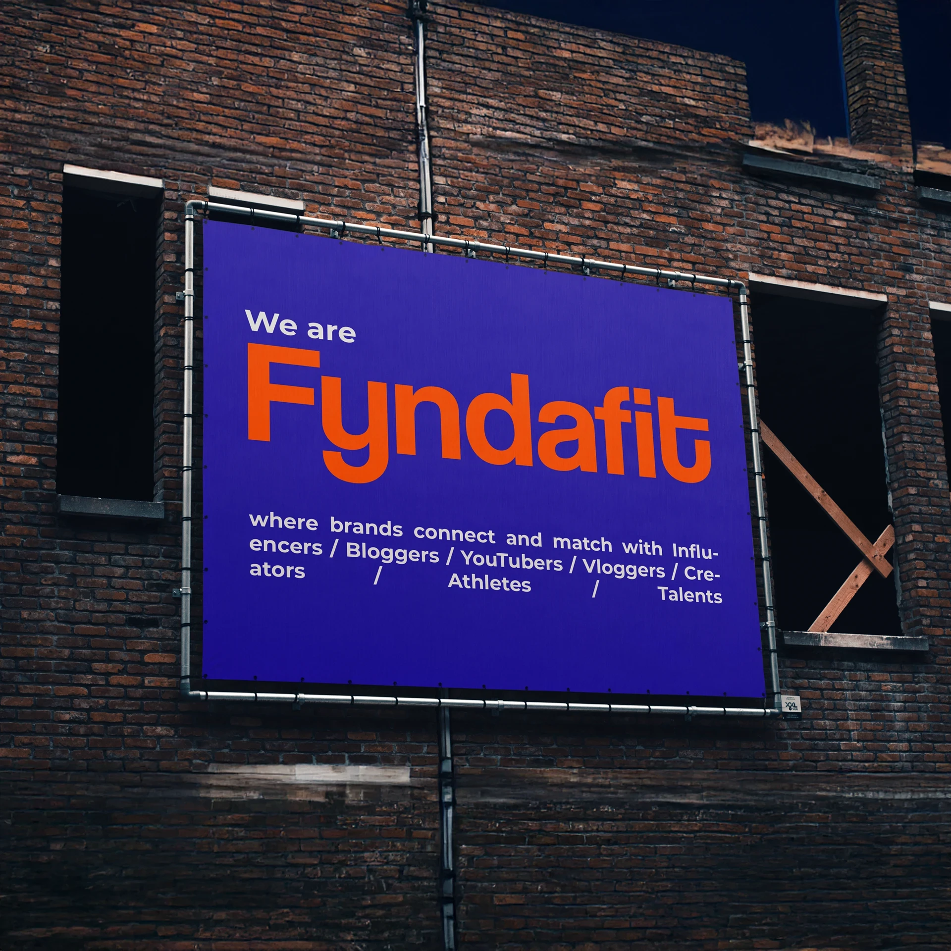
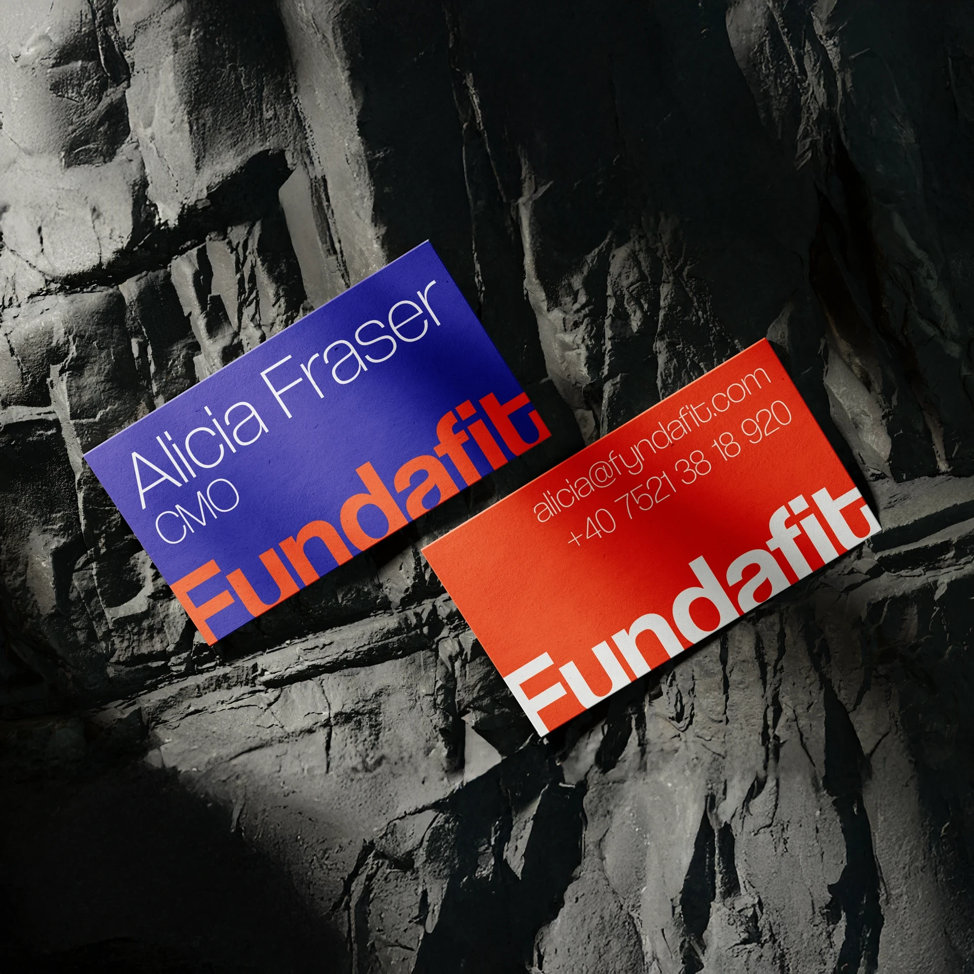
We designed fyndafit's full visual identity from the ground up: a logo, colour palette, and typography system built to feel energetic and sport-driven without tipping into generic fitness-brand cliché. The identity leans into the brand's own playful wordplay, giving fyndafit a visual personality distinct from the sea of near-identical creator agency branding, confident, current, and unmistakably its own.
A system designed to work across brand, creator, and event contexts
Because fyndafit operates across several audiences, brands, creators, athletes, and events, we built the identity as a proper system rather than a single static logo lockup, with consistent rules for colour, type, and application that hold together across a pitch deck, a creator's social content, and an event activation alike. The goal was a brand fyndafit could grow into, not one that would need reworking as the company took on new kinds of partnerships.

Because fyndafit operates across several audiences, brands, creators, athletes, and events, we built the identity as a proper system rather than a single static logo lockup, with consistent rules for colour, type, and application that hold together across a pitch deck, a creator's social content, and an event activation alike. The goal was a brand fyndafit could grow into, not one that would need reworking as the company took on new kinds of partnerships.